Capital.com
Together with a team of 6 designers, I am working on 2 major products: Capital.com and Currency.com, where I hold the position of Senior Product Designer. On this page, I will talk about the main tasks and responsibilities
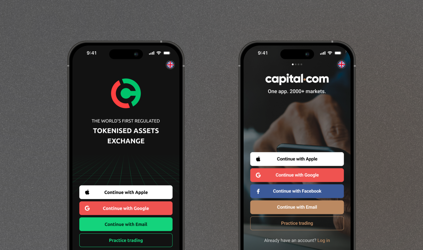
Capital.com is a user-friendly investment platform that provides access to a wide range of financial assets, including stocks, cryptocurrencies, and commodities. By utilizing advanced technologies, educational resources, and excellent customer service, Capital.com helps its clients achieve their financial goals and embark on their path to financial freedom
Currency.com is a revolutionary platform that allows users to invest in both traditional and digital assets, including cryptocurrencies, tokenized stocks, and commodities, using fiat or cryptocurrencies. It provides a seamless experience for trading and investing, combining the benefits of blockchain technology with the accessibility of traditional financial markets
Role
Product Designer
Year
Scope
Links
2022 – Now
Product Design, UX/UI, Prototype, Animation, Web Design, Design System, Research, App, Mentorship
Capital.com, Currency.com
Issue
Solution
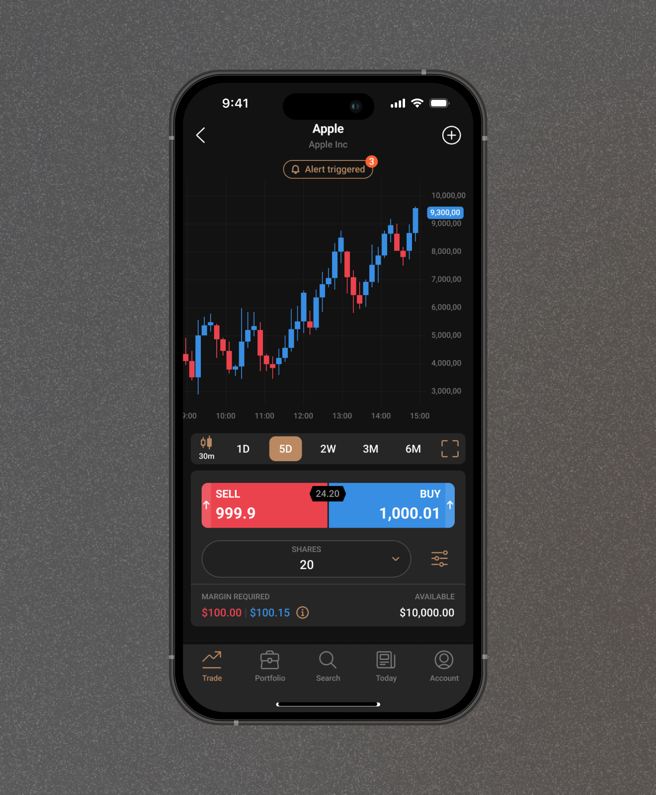
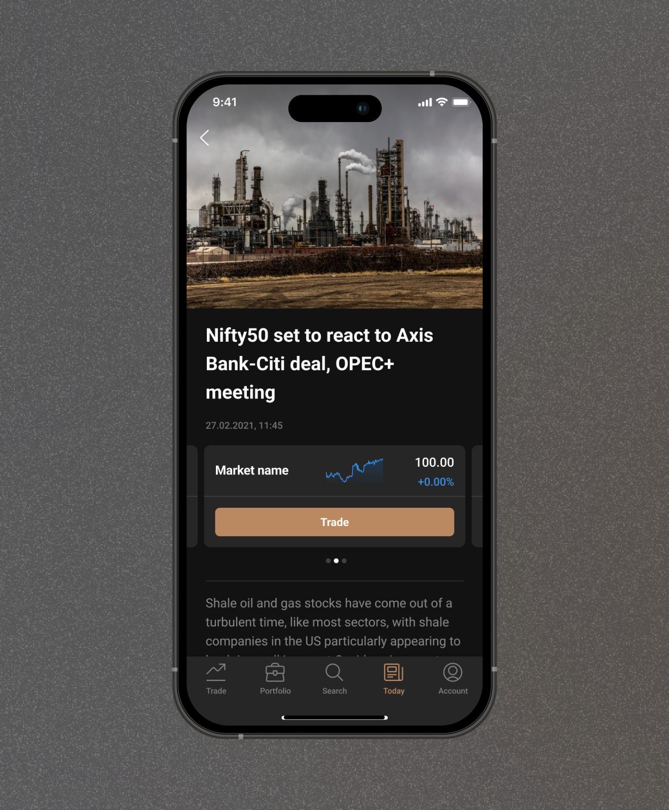
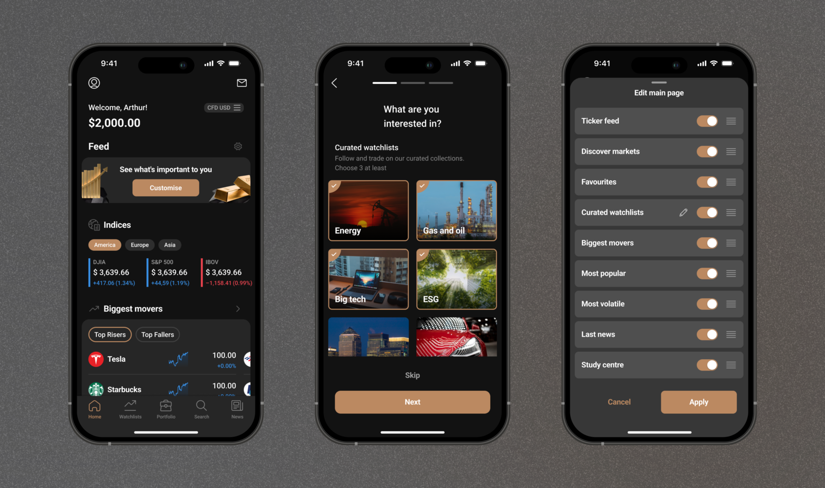
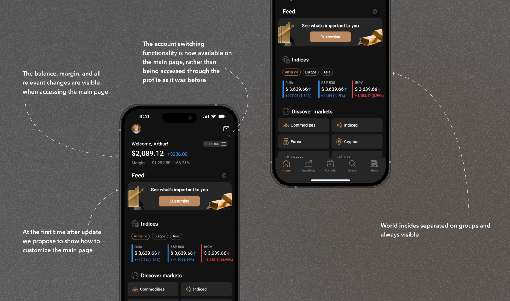
The foundation for the interfaces was created in 2016. Since then, the approach to applications has significantly evolved. We have decided to move towards a SuperApp concept by adding new sections and features. It was necessary to change the overall navigation approach and enable the placement of more blocks on the main screen and menu
We have opted for a widget-based structure, which makes it easier to incorporate new sections in the future. We have added more blocks to the main page tailored to specific users, with interesting collections and customizable categories
In the new structure, we have integrated the "Profile" section, which was previously part of the TabBar. Currently, the "News" section is duplicated on both the main page and the TabBar, but eventually, it will only be available on the main page since not all users utilize its functionality. The "Search" and "Watchlists" sections will be merged into a single section, freeing up two slots in the menu.
Main page
Issue
Solution
The application had a very "dry" and serious feel to it. We decided to add liveliness by updating zero states and incorporating animations.
Initially, I changed the zero states by adding accent colors to them. Then, I demonstrated to colleagues how animations could bring them to life. We implemented the animations to only occur upon the first visit to the page, ensuring they wouldn't become tiresome
Animations
Issue
Solution
In the process of migration and changing responsible personnel who handled the design of the corporate website, we lost access to a significant part of the project. We needed to organize the work of a team of 4 designers to recover the lost assets, create design guidelines and a component library, and conduct design reviews.
I started by restoring the most important and frequently visited pages, which were of utmost priority for the business. Simultaneously, I added them to the library and expanded the UI Kit.
After preparing the most commonly used components, I documented the work guidelines to ensure everyone on the team understood the workflow.
Following the restoration of the six most critical pages, I compiled a comprehensive list of the pages that needed to be recovered and assigned tasks to the team. As a different design team had previously worked on the website, I held a meeting to explain the plan and working rules.
Afterward, I conducted a design review with the team, while also concurrently refining the library and documenting the rules for using the elements.
Website migration
Issue
Solution
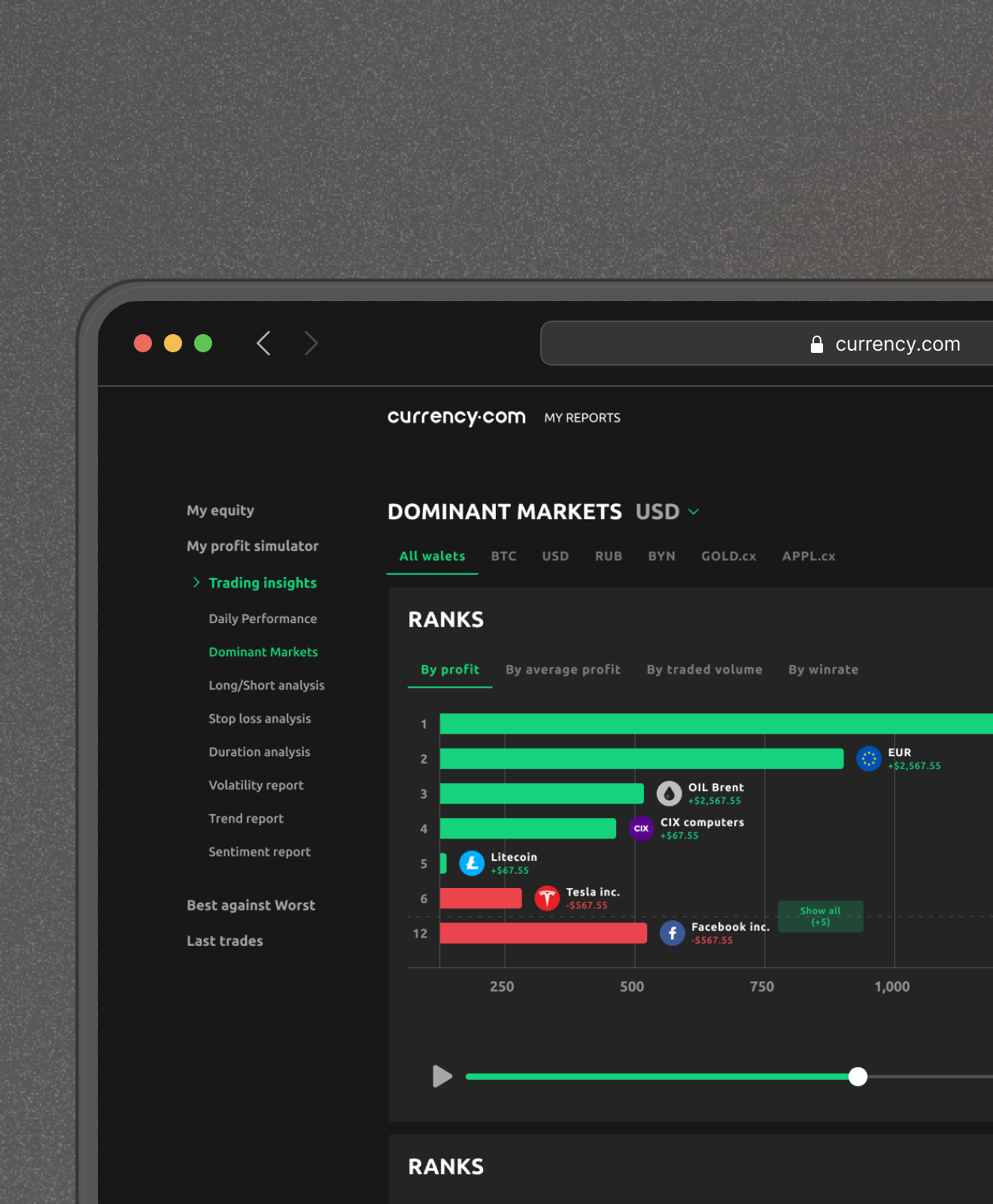
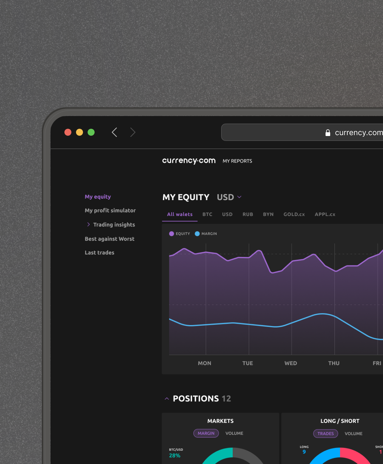
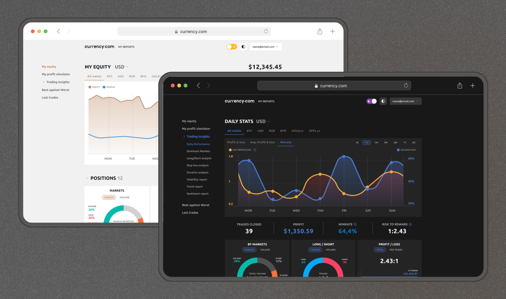
We were working on creating an interface for traders with advanced analytics and statistics for their trades. It was necessary to develop a unified approach to theming, as we wanted to add more options for interface customization and allow people with visual impairments to choose their color scheme
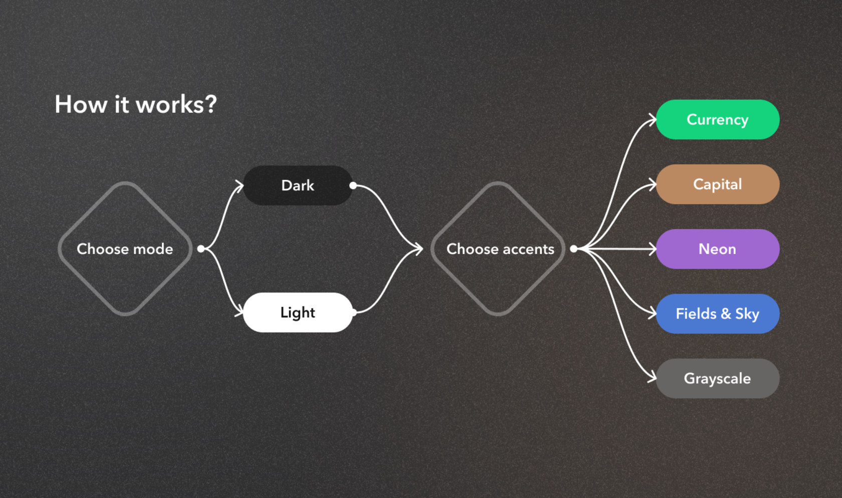
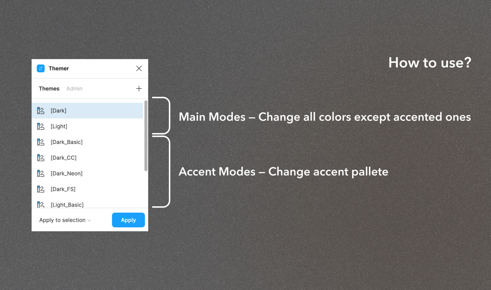
I devised a token system that was later implemented in practice. The system involved separating Accent Colors from Base Colors
In Accent Colors, I kept 4 values that could be substituted with other groups when changing themes.
In Base Colors, I applied the principle of division into Background, GrayScale, Colour, and Static
With this system, we eliminated the need for extensive token duplication in design and development and retained the ability to easily add new themes
TRModes
Issue
Solution
Our email newsletters have never involved designers to provide any structure or establish rules. Additionally, it was decided to create element templates that copywriters and developers could use to code the emails themselves, with designers only conducting design reviews
By formulating a work plan and conducting competitor analysis, we developed a framework for subsequent work.
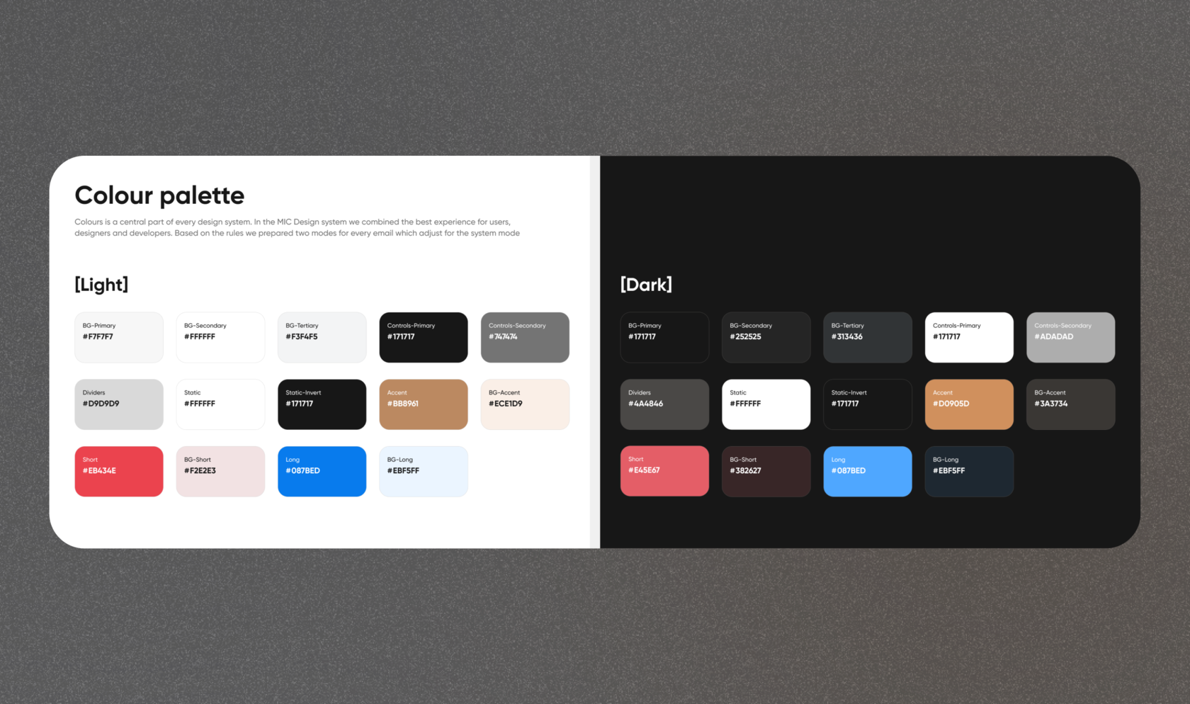
It was crucial to consider the numerous constraints associated with emails (varying theming handling, font restrictions, maintaining structure during forwarding, etc.).
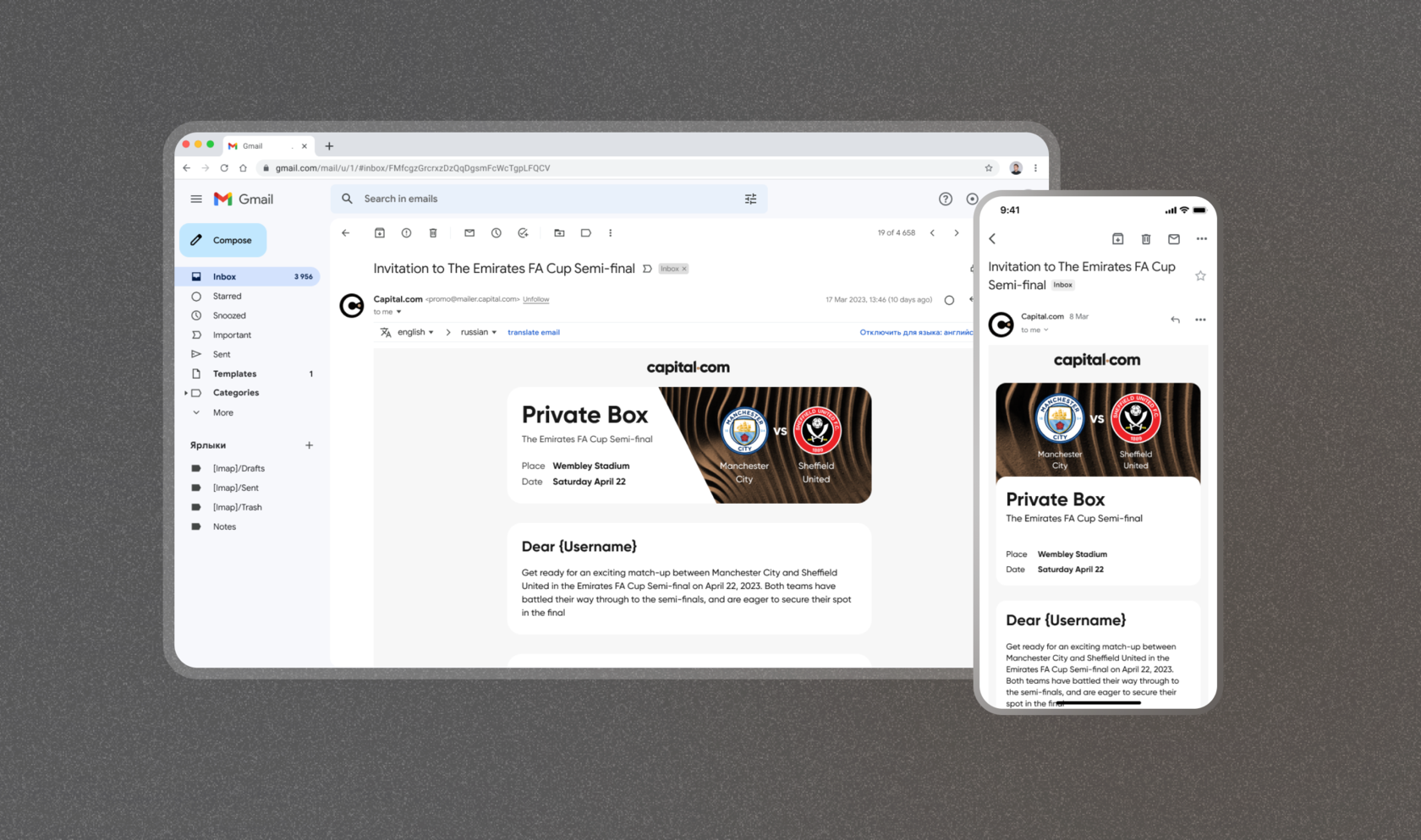
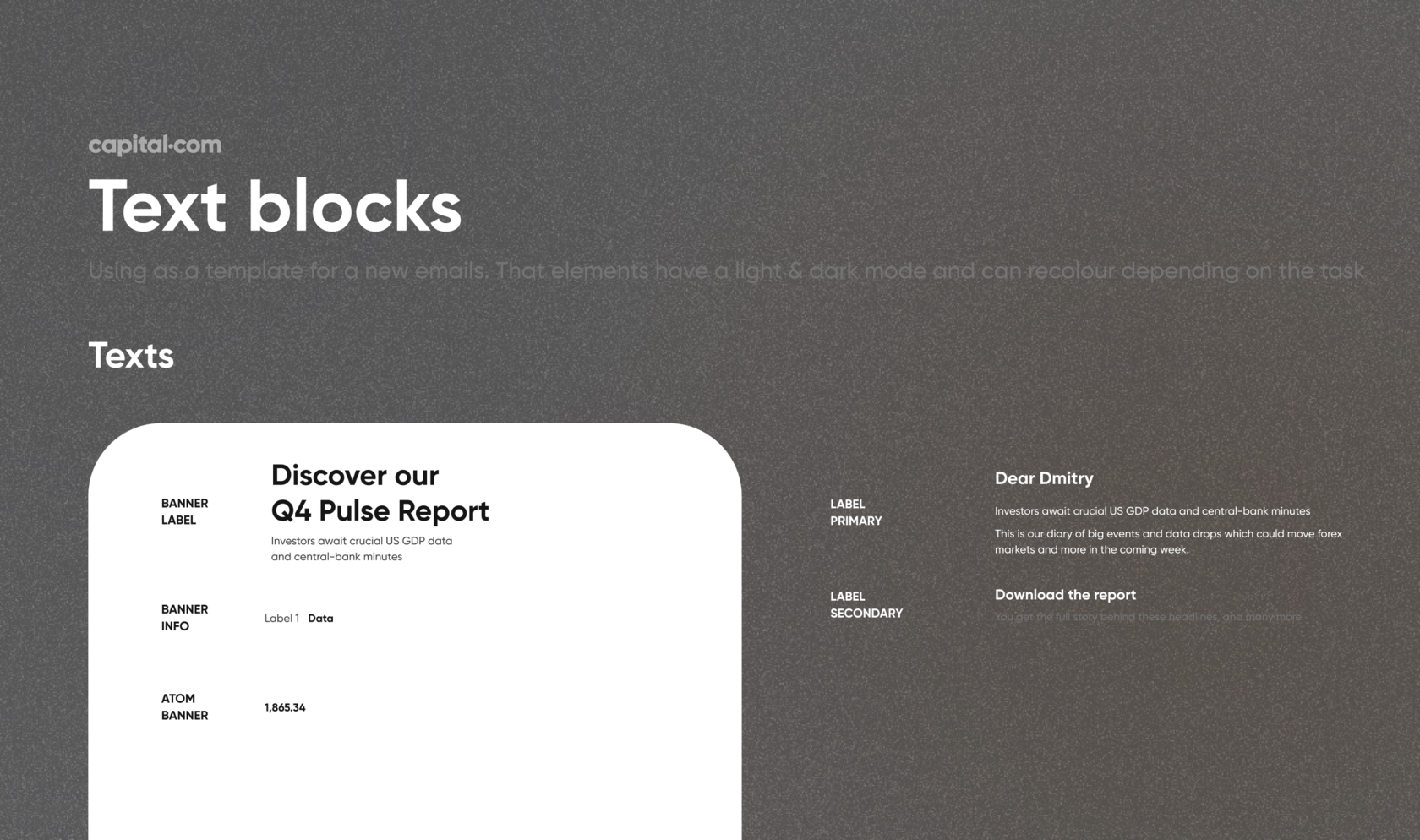
Therefore, we concluded that emails should be simple in terms of coding, with clear guidelines for typography and colors. Essentially, we created a builder that could be used not only by designers but also by other teams.
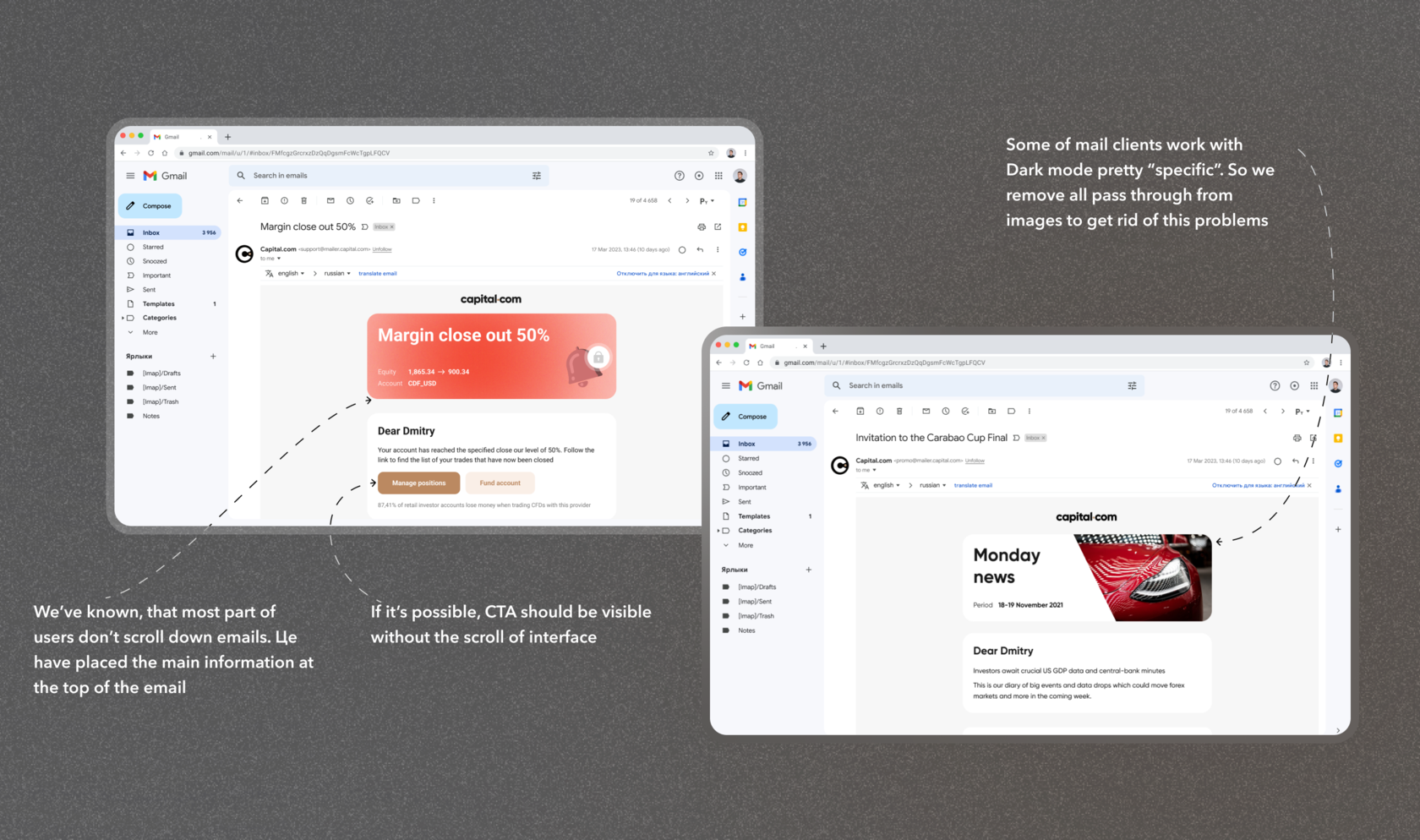
Additionally, I recognized the issue that only a small percentage of users scroll to the very bottom, so I placed the most important information in the banner at the top.
EDS
